Our logo is a visual representation of the company’s brand. It serves as a unique and recognizable identifier for EC as an entity and visually carries the weight of us as a brand. Our logo should be communicated at all times and used carefully by following the guideline detailed below, ultimately helping us establish a strong and competitive brand identity in the AI space.
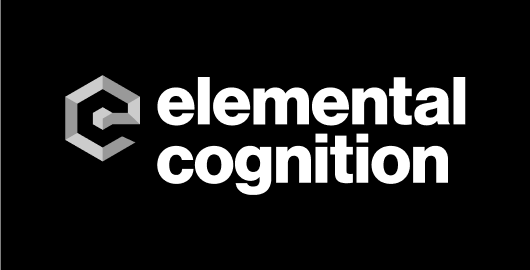
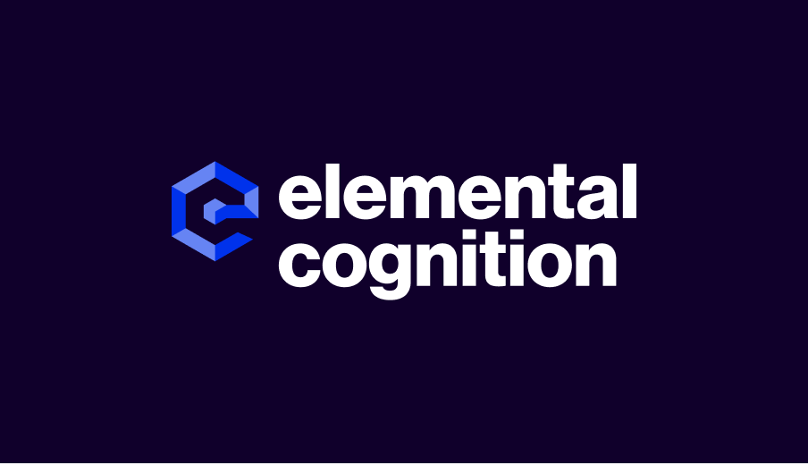
The original EC logo has been successfully representing the company since 2015. The rebranding of this logo was initiated in early 2023 with the primary purpose of the company’s preparation to go to market. With the rapid emergence of AI to the consumer, the rebrand was necessary to show how the company has grown and cuts its path in this rapidly growing market.
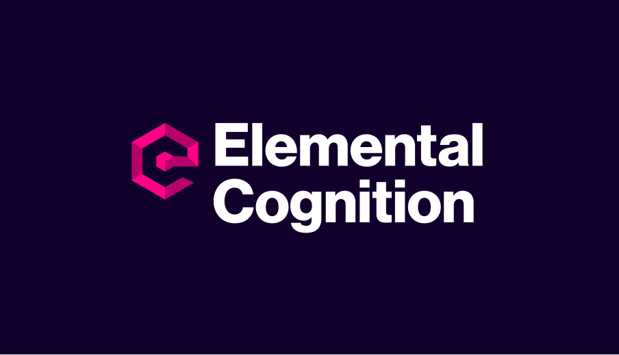
Elemental Cognition’s Logo, established 2015
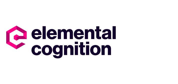
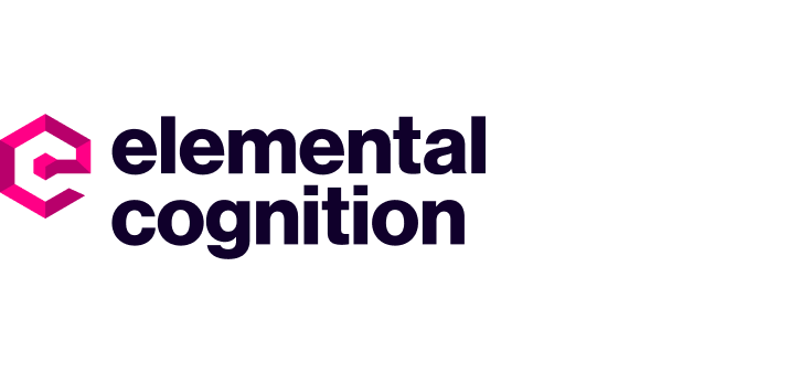
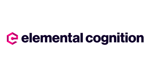
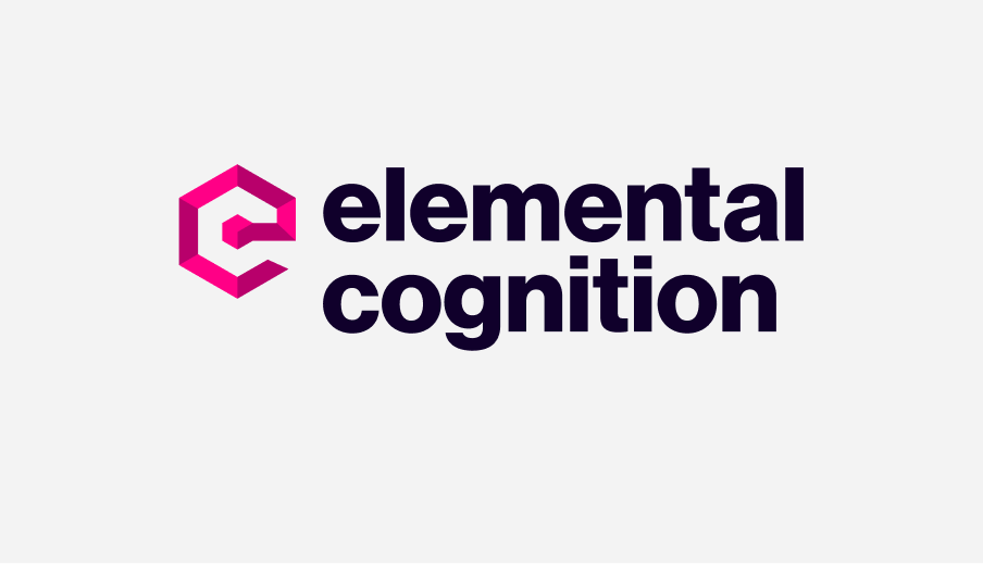
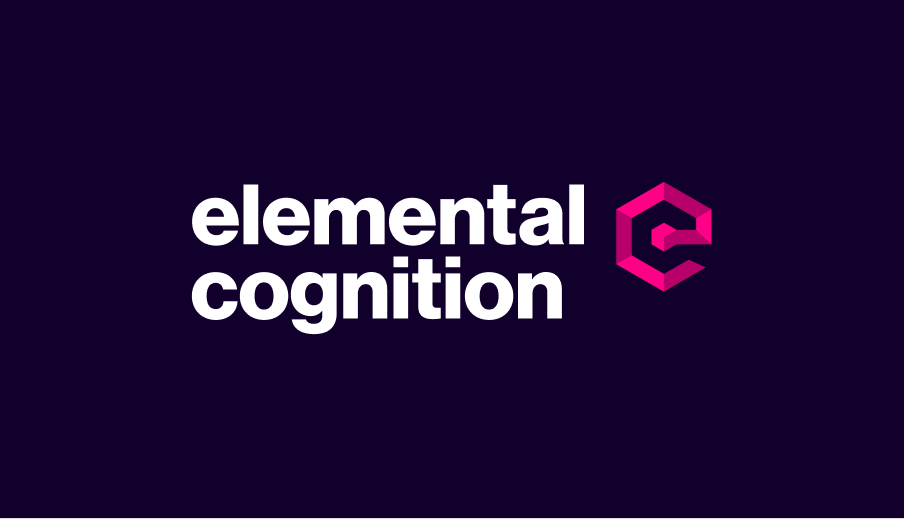
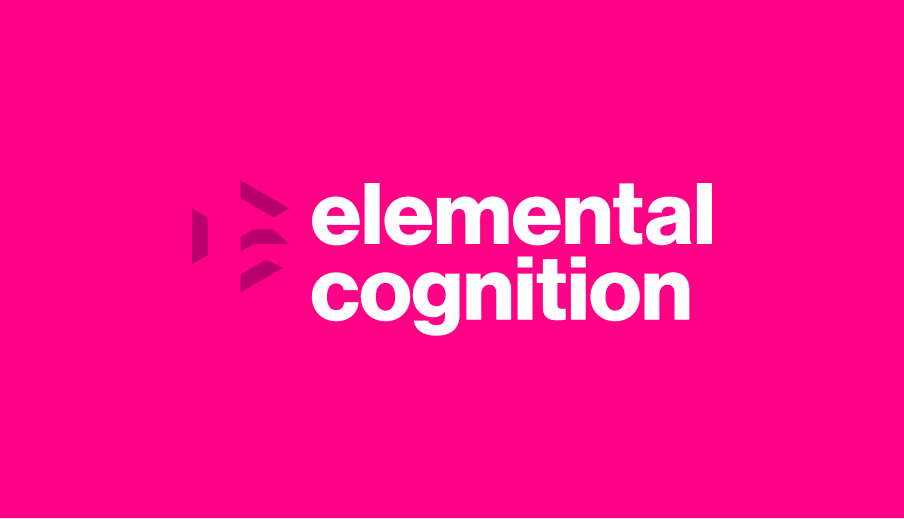
New Elemental Cognition Logo, established 2023
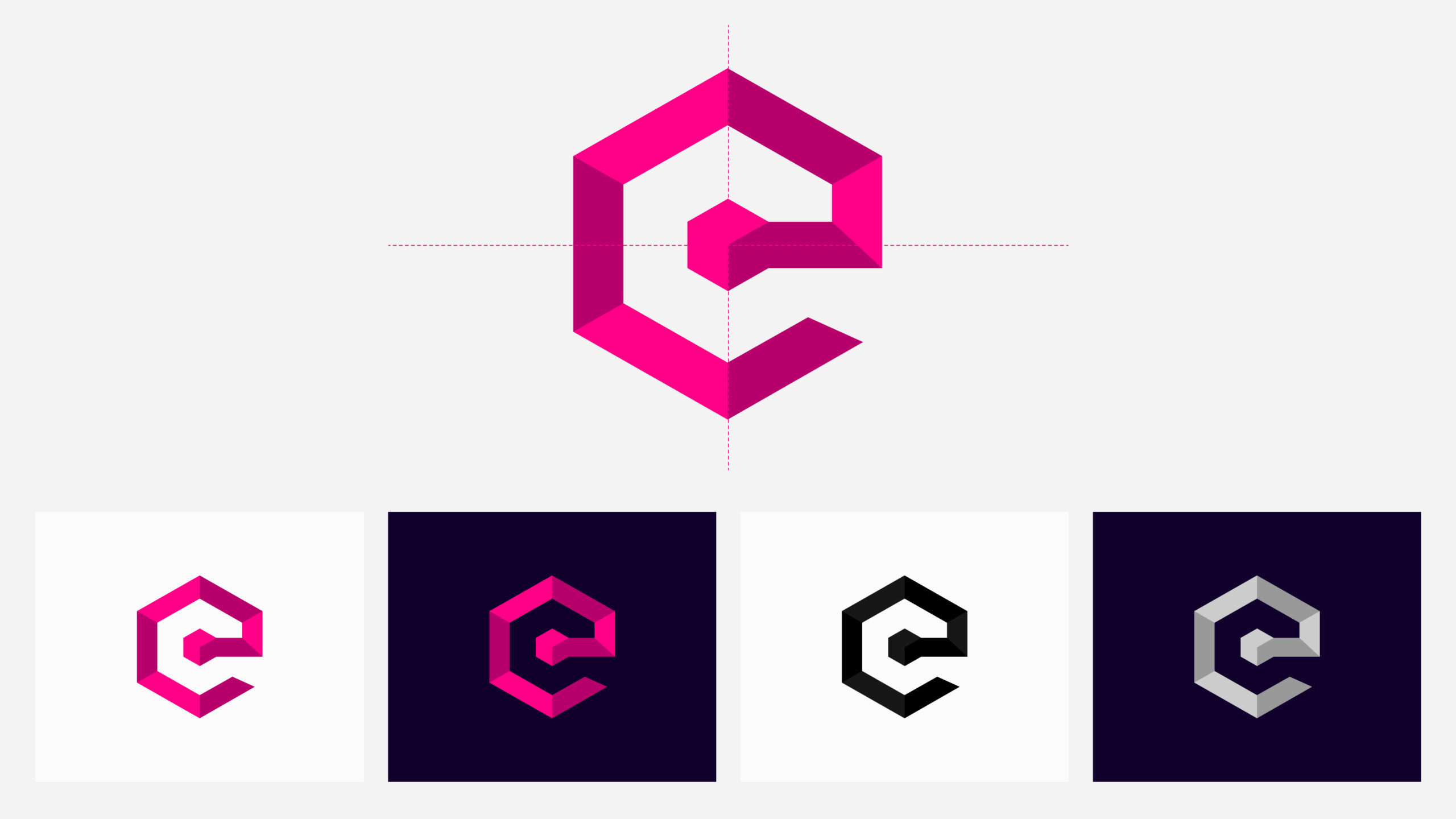
Our AI is the digital epicenter that powers all our products, from Cogent to Cora. We have visually embodied this in our logo, which, at the center of it, the primary device sits strategically harboring all the company’s brand values and visually representing the AI’s beating heart.
It encapsulates the very essence of what EC is about, embodying the innovative spirit and cutting-edge technology that lies within. As the beating heart of our logo, AI signifies our unwavering commitment to creating products that deliver exceptional results.
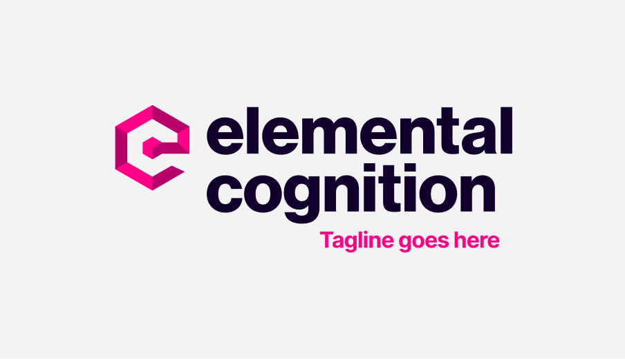
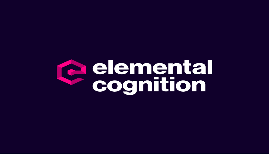
Elemental Cognitions Primary Stacked Logo
Elemental Cognitions Secondary Landscape Logo
The new EC logo is available in its primary form of full-color stacked and in its secondary form of landscape, allowing it to suit more height-constrained spaces. Our Elemental Cognition logo is offered in multiple styles and formats to meet several design requirements, including:
- Primary Stacked Full Color
- Primary Stacked Full Color Reversed
- Secondary Landscape Full Color
- Secondary Landscape Full Color Reversed
- Black with Icon Shade
- Black Flat
- White with Icon Shade
- White Flat
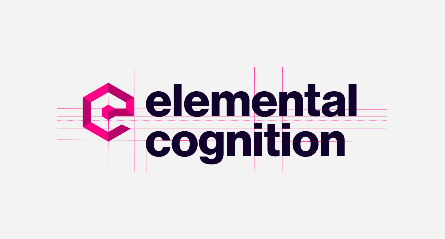
Our logos are all constructed on a carefully measured grid to optimize visibility with varying uses and scales in mind.
Primary Logo
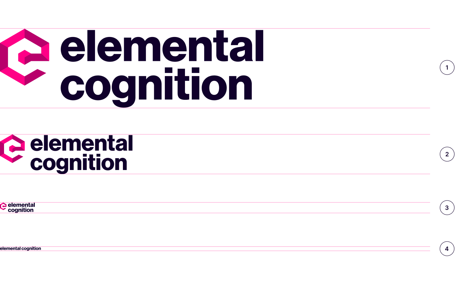
Our primary logo has been carefully constructed and visually balanced in a stacked format to hero most internal and external communications. The logo has a bold icon that emerges from a central cube and rolls out, forming our elemental ‘e’ and, within the negative space creating our cognition ‘c.’ The logotype is also robust, and its bold letterforms are left aligned and positioned to give it a solid visual weight.
Primary Stacked Logo with Shade for light backgrounds (positive)
Primary Stacked Logo with Shade for dark backgrounds (reversed)
Black Stacked Logo with Shade for light backgrounds
White Stacked Logo with Shade for dark backgrounds
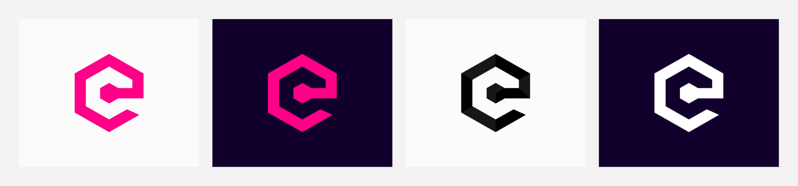
The logo is offered in several forms, but without constraints, we prioritize using our two primary logo styles, full color positive for light non-complex backgrounds or reversed for positioning on dark non-complex backgrounds. When color-constrained or background complexity constrained, we can fall back to the primary logo’s black or white shade style forms. The black and white forms are also offered in one color, ‘flat’ styles.
Secondary Logo
Our secondary logo has been reworked into a more linear landscape form. This logo’s purpose is to enable design flexibility when space, particularly height, is a constraint. We offer this logo in the same set of styles and formats, so the same careful consideration should be given to its application.
Secondary Landscape Logo with Shade for light backgrounds (positive)
Secondary Landscape Logo with Shade for dark backgrounds (reversed)
Secondary Black Landscape Logo with Shade for light backgrounds (positive)
Secondary White Landscape Logo with Shade for dark backgrounds (reversed)
EC Icon
Our icon is a significant identifier for EC as a company, and any standalone use should be considered. Visually this device we’ve created allows us to future-proof the company’s vision and ethos, Creating new cutting-edge intuitive products, all built around and powered by EC’s innovative AI. Each new release or platform is still ultimately powered by our foundation.
Full color and monotone icon suite with shading applied
Full color and monotone icon suite, ‘flat’, with no shading applied
The device is in its shade style, offering a three-dimensional appearance of its hexagonal path and a ‘flat’ style where no additional shading is applied. We also have this device available in a full suite of options, including shade and flat monotone versions for light and dark backgrounds.
Scale
Any of EC’s logos being resized must always be scaled proportionally. To ensure the logo is always clear, we have reached a series of minimum size rules to which the logo can be scaled down. Based on the logo’s height dimension, we break this down into critical breakpoints. The basis of this is how we consider a logo presented visually at smaller sizes and how elements of the logo, such as shading, can degrade the logo’s appearance or if the legibility of the logotype itself becomes compromised.
1. Large
Always use the Primary logo with a gradient for larger logo applications.
2. Medium
Use the Primary logo with gradient for logo applications of a height of 25px or greater.
3. Small
Use the Primary or Secondary logo without the gradient for logo applications with less than 25px in height.
4. Extra Small
For applications that require a very small logo, 10px or less in height, use the landscape logotype with no icon.
As denoted above, we have created a tangible scale that dictates the usage of a specific logo style based on the size used. Anything considered normal or large should use our primary stacked version with shade. When the logo is scaled down to 25px or less, we switch to our ‘flat’ version, as the shade visually compromises the icon’s appearance. The final breakpoint is 10px or under, where we have created a ‘tiny’ version for tiny applications where the icon is omitted entirely and the logo is represented by the logotype only.
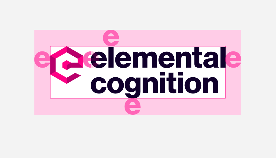
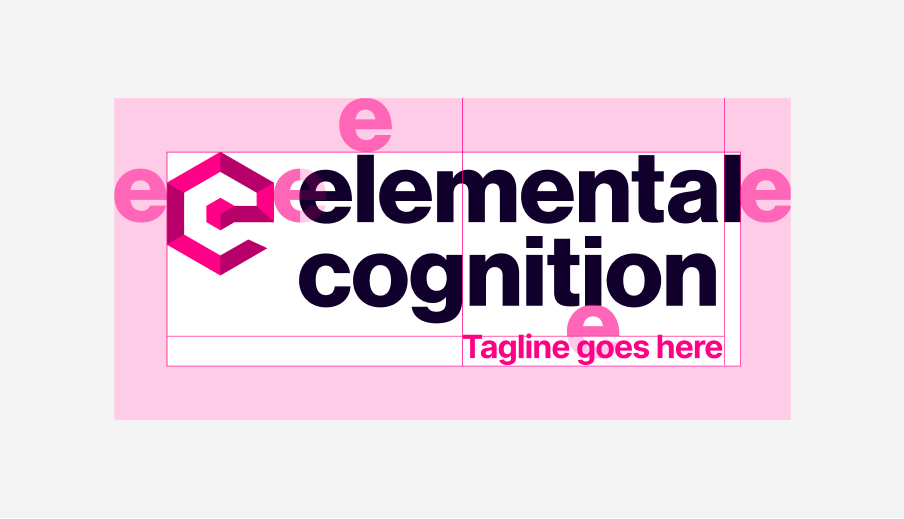
Clearspace
Clearspace is a crucial aspect of logo design that should always be noticed. It refers to the empty space surrounding a logo, ensuring it remains visually distinct and impactful in any application. Clearspace is an aesthetic consideration and a crucial design principle that influences a logo’s overall effectiveness and impact. It’s a fundamental aspect of logo design that significantly enhances brand recognition, consistency, and professionalism.
Clearspace with no tagline applied
Clearspace with a tagline defined
Our Clearspace is defined relative to 1xe at the extremities of the logo. Internally we also use our ‘e’ to define spacing within the identity components. The space between the logotype and icon is represented by 0.5xe on its vertical axis. The tagline version is also determined by 0.5xe on its horizontal axis. Clearspace ensures our logo is given clear visibility and space to breathe within a design.
Partnerships
Maintaining a solid and consistent brand image is essential, especially regarding logo partnerships. To ensure the visual integrity and clarity of our brand identity, we have established some proximity guidelines for using our logo in partnership with other brands that employ many of our Clearspace principles.
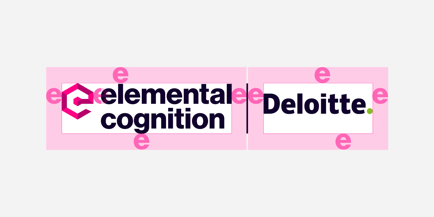
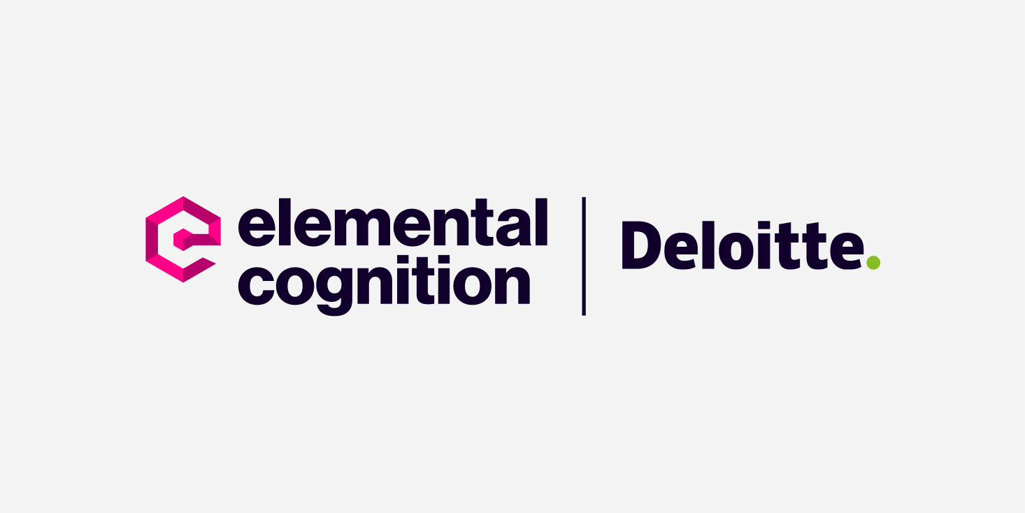
Primary Logo Partnership maintains a total combined Clearspace of 2xe
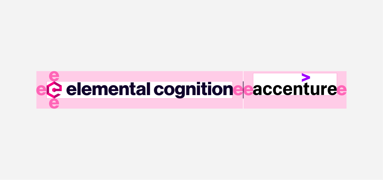
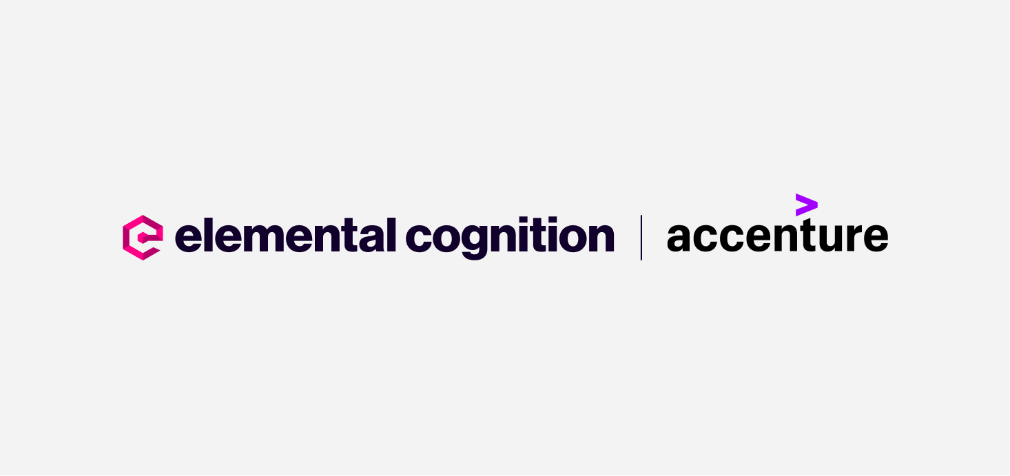
Secondary Logo Partnership maintains a total combined Clearspace of 2xe
Adhering to these proximity guidelines can create powerful and cohesive logo partnerships that elevate both brands while respecting each other’s visual identity. Consistency in logo usage reinforces our brand’s authenticity and professionalism, ensuring a positive market perception.
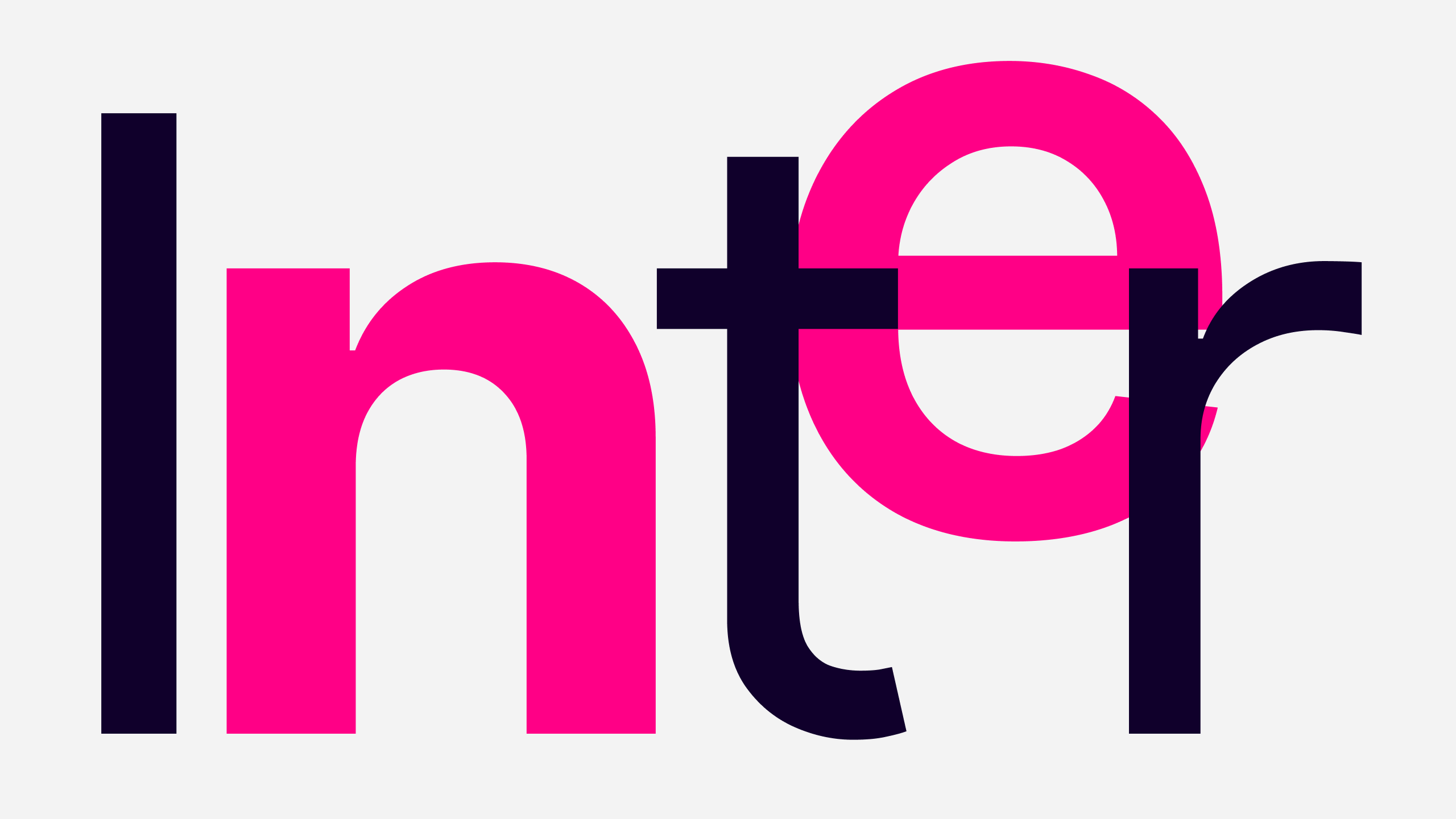
Typography
We have chosen the font ‘Inter‘ by Rasmus Andersson to communicate to our audience on behalf of our brand. Inter is a highly optimized variable font family carefully crafted & designed for computer screens. It is considered a friendly font that communicates sincerity.
Inter features a tall x-height to aid in the readability of mixed-case and lower-case text. Several OpenType features are also provided, like contextual alternates that adjust punctuation depending on the shape of surrounding glyphs, slashed zero for when you need to disambiguate “0” from “o,” tabular numbers, etc. Source: Google Fonts
The quick brown fox jumps over the lazy dog
Inter Bold 700
The quick brown fox jumps over the lazy dog
Inter Medium 500
The quick brown fox jumps over the lazy dog.
Inter Normal 400
The quick brown fox jumps over the lazy dog.
Inter Light 200
Inter is a versatile typeface suitable for both print and digital media. Its balanced design allows for easy legibility in various sizes and across different platforms. We use a selection of weights to represent the EC brand. Bold 700, Medium 500, Normal 400, and Light 200. An entire web and Print typography scale will soon be available as part of our Identity Tool Kit.
Color
Color is a fundamental element in design and plays a crucial role in shaping how audiences perceive and interact with visual content. EC emits a powerful color palette for the AI space. A combination of eye-catching Magenta and deep dark Purple to ready the brand for impact in the AI space.
Brand Colors
The EC Brand colors are ‘Brand Pink Primary’ (Magenta), Brand Pink Secondary (Dusty Magenta), and ‘Brand Dark,’ a rich dark Purple to invigorate our Brand Pink. Magenta is an unconventional choice, eye-catching, strong, and inspiring. It stands out and proud from the ever-increasing crowd as AI commands our attention in 2023.
Brand Pink Primary
Process Magenta C
C=00 M=100 Y=00 K=00
#FF0066
Brand Pink Secondary
Pantone 227C
C=00 M=100 Y=00 K=28
#B8006B
Brand Dark
Pantone 5255C
C=100 M=74 Y=00 K=84
#10002B
Neutrals
Neutral tones are prized in design for their ability to create balance, provide contrast, and serve as a foundation for other colors. They work well with vibrant hues and other neutrals, allowing designers to create a harmonious and cohesive visual experience. These gray tones are introduced for their subtlety and lack of strong chromatic intensity. Our neutral tones support and add depth to our design language, enabling us to create layers of information and ensuring our brand colors maintain their visibility and intensity.
#171717
#333333
#4C4C4C
#666666
#808080
#999999
#B2B2B2
#CCCCCC
#E5E5E5
#F3F3F3
#FBFBFB
#FFFFFF
Product UI
In addition to our Brand and Neutral palettes, We have established our UI palette to help establish an informative and structured product design system and help our users understand certain global conditions and states in a conventional product experience. Our UI palette is primarily used for our product suite and enables us to build out our user experiences following traditional color patterns and definitions.
#000000
#0032EB
#05944F
#E2A327
#E11900
#F8DF03
A complete tonal definition guideline of our Brand, Neutral, and UI Color Palettes will be available soon as part of our Identity Tool Kit.
Iconography
Iconography in a design system reinforces the brand identity, creating a cohesive and recognizable look across various touchpoints, such as websites, apps, marketing materials, and product interfaces. They are a vital component of a design system, providing consistency, clarity, and user-friendly experiences.
Our branded Iconography is a developing suite of assets still being prepared for release. The set below is an example showcase, exposing some of our work in progress. We are working toward a full bespoke icon suite to support our base utility icons. Watch this space.


Do’s & Dont’s
A logo is a powerful thing in its own right, and being in charge of its use and placement is a weighty responsibility. It is much more than just graphic design. It is the embodiment of a brand’s identity and values. It is a powerful brand recognition, differentiation, storytelling, and trust-building tool. Our logo should therefore be treated with care and consistency. A few simple but essential rules must be employed to ensure its integrity remains intact as an enduring symbol of EC’s brand.
Do Not modify any part of the colour of the logo
Do Not change the position of the icon
Do Not change the proportions of the logo
Do Use the appropriate logo for the application
Do Not modify letters on the logotype
Do Not place the logo on backgrounds of similar colour
Do Not position the logo directly onto a complex background
Do position the logo in an area of clear contrast
EC’s visual identity is brand new, and its rules and systems are evolving. We are working to cement these systems in place and ensure viable assets are released at a regular cadence. If anything is required for a project that is not currently available in our Identity Kit or if there is information not covered in our guidelines here, please contact [email protected].